Marinela
Organic Skincare Line for Mother and Baby
The client was from Croatia and wanted her culture to shine through the product and focus on how organic the brand is and keep to a premium spa look.
She wanted to sell her product at high end spas and Motherhood stores in the United States.
I collected a competitive analysis of personal care products around that range, presented mood boards to gauge direction and presented conceptual artwork.
The design limitation was the name of product. The client changed it multiple times throughout the design process. This was my conceptual piece that was chosen by the Creative Director and presented to the client.
Scroll down to view in more detail.
Marinela - Final Product Lineup.
Marinela - Alternate Options Presented.
Marinela - Sketches.
Bath & Body Works
Rebranding Concept
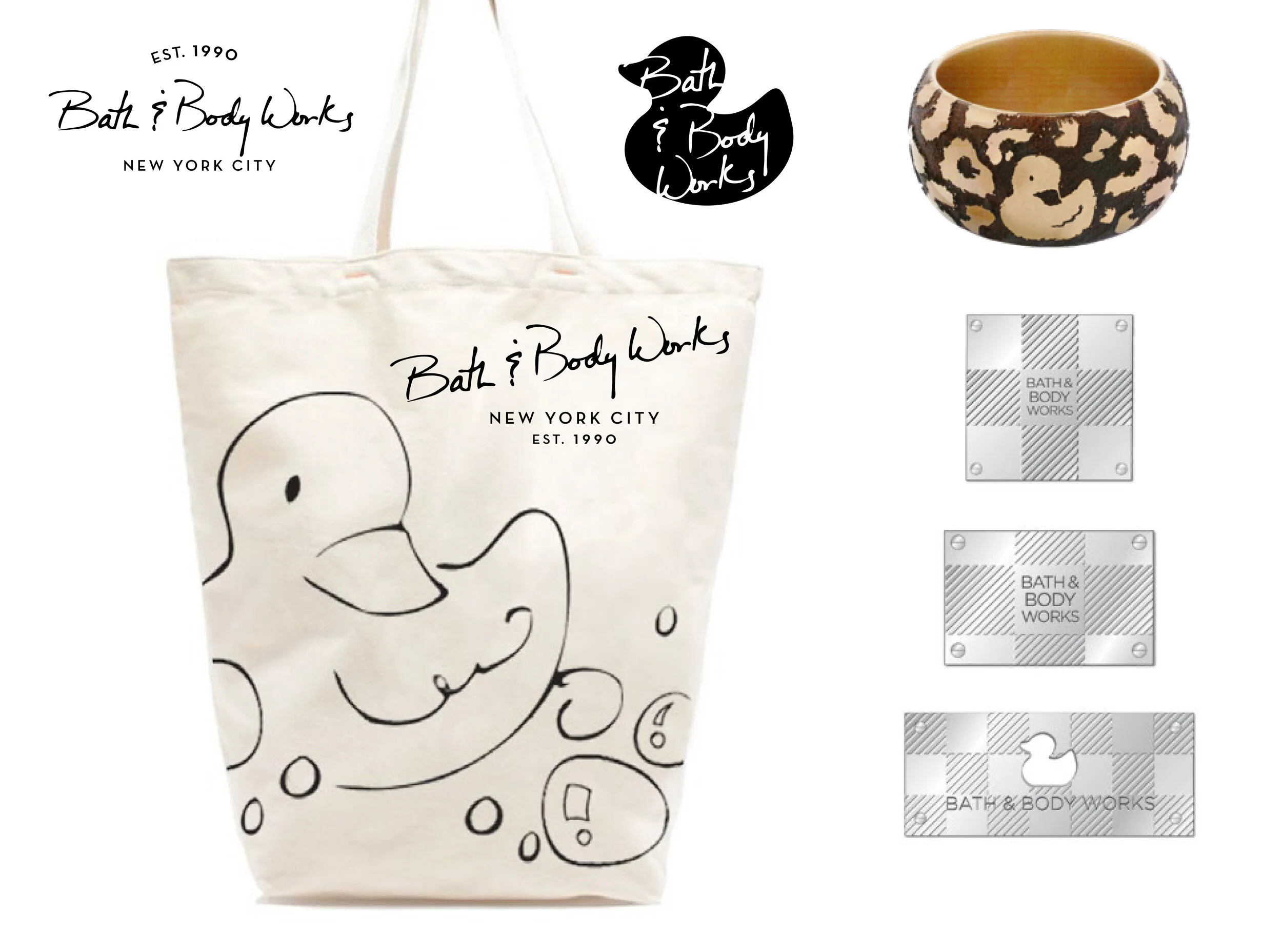
This project was an In-house rebranding concept which I worked closely with the Art Director and Senior VP of Home Fragrance to develop.
There was a lot of initial sourcing of past branded materials to understand the brand. One of the many options was to focus on the iconic rubber ducky and how to elevate the icon into something more modern and own-able.
I sketched out rubber duckies in different poses, even hand wrote some fonts for an elevated and sophisticated look and these are the options that the Senior VP of Home Fragrance resonated with and presented.
I photoshopped sketches and icons onto various items to complete the look.
Bath & BodyWorks - Designed Rebranded Logo on Various Products.
Bath & BodyWorks - Rebranded logo applied to Store Front.
Dr. Susan Taylor’s RX for Brown Skin
Skincare Curated for People of Color
Although, Sephora loved the product marketing concept, they rejected the product because of the design not fitting in the Specialty Mass Mid to High End Market space.
Design limitations were to revise graphics and finishes of the bottle pump only. The name could not change. The client gave us a very short timeline and budget for a final logo design. The main question was “What is ‘Brown Skin’?” It is not a specific group of people. It is many shades and cultures. How do I speak to everyone and visually communicate ‘on-trend clinical skincare’?
I collected a competitive analysis of cosmetic products around that range, presented options to the Creative Director and the client picked my logo for final production.
Sephora approved the design and the product line was launched in Sephora stores nationwide.
RX for Brown Skin - Final Product Line up.
RX for Brown Skin - Alternate Logo Options.
RX for Brown Skin - Logo Before & After .
Berkeley Heights Restaurant Week
Print, Web and Social Media Campaign
The Berkeley Heights brand was a few color swatches and a train station done in watercolor and 2 typefaces.
With respect to what the client had already established, it was a role where I consulted the client team through the design process by asking questions, presenting preliminary design styles to help them see where they wanted to go. As well as suggesting my thoughts on direction with time and budget constraints.
The overall result was a piece that the client felt they had a part in and was happy with. I have also helped this client team with their brand book, website and other materials later on.
I applied graphics to a website, various printed materials and helped source printers. A social media campaign was also designed.
Berkley Heights Restaurant Week - Printed Materials.
Berkley Heights Restaurant Week - Alternate Logo Options.


